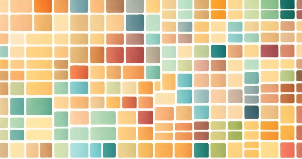
A color combination palette is a coordinated set of colors selected to work well together in visual design, based on principles of color theory and aesthetic harmony. It defines the dominant hues, accents, and neutrals used in a project to ensure visual consistency and emotional impact.
Designers use color combination palettes to unify elements across websites, branding materials, fashion lines, and digital interfaces. A well-chosen palette avoids clashing tones and guides user attention through intentional contrast and balance. The goal is not just visual appeal but effective communication.
Palettes are often derived from color wheels, which map relationships between hues. Common strategies include using adjacent colors (analogous), opposites (complementary), or triadic sets spaced evenly around the wheel. These systems provide a foundation for selecting colors that feel cohesive rather than random.
Color combination palettes rely on predictable interactions between hues, saturation, and brightness. When colors share similar lightness values, they appear to belong together. When they differ, they create contrast that draws focus.
For example, a palette built from blue, teal, and gray uses low saturation and medium-to-high lightness. This creates a calm, professional look ideal for financial dashboards or wellness apps. In contrast, a palette of electric yellow, magenta, and black generates high contrast and energy-suitable for music festivals or youth-oriented brands.
Palettes can also follow mood-based themes. A "warm sunset" palette might include burnt orange, deep red, and golden yellow-colors associated with warmth and nostalgia. A "cool ocean" palette could use navy, seafoam green, and pearl white-evoking serenity and clarity.
Designers typically choose from five standard types, each serving different purposes:
| Type | Composition | Use Case | Example |
|---|---|---|---|
| Analogous | Three colors adjacent on the color wheel | Harmonious, natural-feeling designs | Blue, blue-green, green |
| Complementary | Two colors opposite each other on the wheel | High contrast, attention-grabbing visuals | Red and cyan |
| Split-complementary | One color and two adjacent to its complement | Changing yet balanced | Green with red-orange and yellow-orange |
| Triadic | Three colors evenly spaced around the wheel | Vibrant, lively compositions | Red, yellow, blue |
| Monochromatic | Shades, tints, and tones of a single hue | Minimalist, focused designs | Dark navy, medium blue, sky blue |
Each type influences perception differently. Complementary palettes create tension and excitement-ideal for calls to action. Monochromatic schemes feel unified and elegant, often used in luxury branding.
The Apple website uses a monochromatic palette of white, light gray, and soft black. This choice emphasizes product imagery and ensures readability across devices. The lack of bold color keeps focus on function and form.
Netflix's interface relies heavily on a complementary palette: dark charcoal backgrounds with bright orange buttons. This contrast makes navigation intuitive and highlights interactive elements. The orange is saturated enough to stand out but not so intense it feels aggressive.
A frequent error is assuming all bright colors go together. Using neon pink, lime green, and electric blue in one layout causes visual fatigue. According to the Color Science Division of the Society of Imaging Science and Technology, excessive chromatic contrast reduces legibility and increases cognitive load.
Another mistake is ignoring context. A palette that works on a desktop screen may fail on mobile due to smaller screens and lower color accuracy. Always test palettes under real-world viewing conditions.
Many people confuse a color combination palette with a design theme. A theme includes layout, typography, iconography, and interaction patterns. A palette is strictly about color.
For example, a "retro-futurism" theme might use geometric shapes, bold sans-serif fonts, and metallic textures. Its color palette could include chrome silver, deep purple, and acid yellow. But the same palette-chrome silver, purple, yellow-used in a children's book would feel jarring because the theme doesn't match.
This distinction matters because swapping palettes between projects without adjusting the theme leads to inconsistent branding. A logo designed with a warm analog palette won't read the same if placed on a cold, monochromatic background.
I once helped design a menu for a neighborhood café in Portland. The owner wanted something warm and inviting but not overly rustic. We started with a base of beige (#F5F0E6), then added terracotta (#CC7722) for accent, and finally a muted sage green (#8C9C7A) for subtle contrast.
We avoided pure red or bright yellow-those felt too loud for a quiet morning space. Instead, we tested the palette on printed samples under café lighting. The beige looked slightly warmer in natural light, so we adjusted the hex code to #F6F1E8 to prevent it from appearing washed out.
When we presented the design, the owner said, "It feels like stepping into a sunlit kitchen." That reaction confirmed the palette matched the intended mood-not just visually, but emotionally.
Modern tools like Adobe Color, Coolors, and Figma's auto-palette generator automate the creation process. But these tools don't replace judgment. Always verify palettes with accessibility standards-contrast ratios must meet WCAG 2.1 Level AA for text.
For instance, a light gray text (#D3D3D3) on a white background fails contrast checks. Replacing it with #666666 improves readability. Use tools like WebAIM's Contrast Checker to validate choices.
Remember: a color combination palette isn't just a list of favorite colors. It's a strategic tool for shaping perception, guiding behavior, and reinforcing identity. Whether designing a website or packaging a product, the right palette makes the difference between confusion and connection.