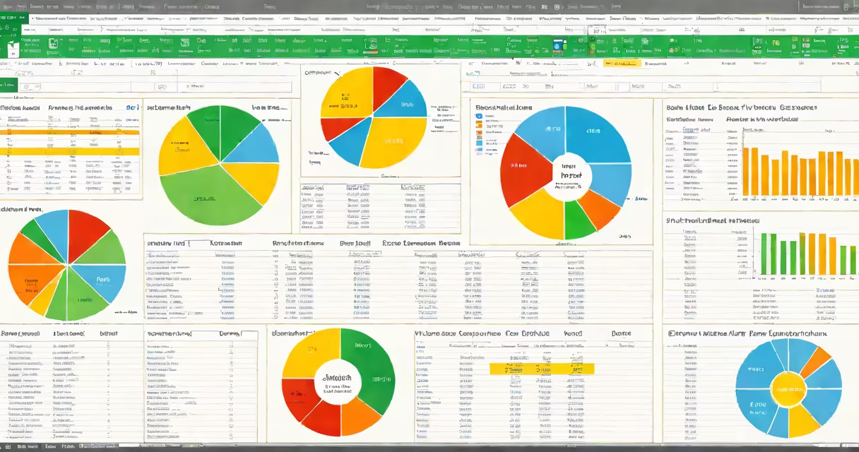
pivot table analysis is a method of summarizing large datasets by dynamically reorganizing and aggregating data based on selected fields. It enables users to explore relationships, identify patterns, and generate reports without writing formulas.
At its core, pivot table analysis turns rows of data into structured summaries. Instead of manually filtering or using SUMIFs, you drag fields into rows, columns, values, and filters. The tool recalculates instantly when you change the layout, revealing new perspectives on the same dataset.
For example, a retail manager with 10,000 sales records can group transactions by region, product category, and month. By placing "Region" in rows, "Product Category" in columns, and "Sales Amount" in values, they see total revenue per product in each region. This reveals which products sell best in specific areas-information that would take hours to extract manually.
Pivot table analysis operates on four zones: Rows, Columns, Values, and Filters. Each field you place in a zone changes how the data aggregates and displays.
When you assign a field to Rows, it becomes the primary category. For example, placing "Customer Segment" in Rows creates one row per segment. Adding "Month" to Columns splits the data across time periods. The Values area holds numeric data-like sales, units sold, or profit-that gets summed, averaged, or counted.
Filters allow you to narrow the view. Selecting "Q3 2023" in the Filter zone shows only data from that quarter. You can drill down further by clicking on a value-say, "West Region"-to see underlying details without leaving the report.
Pivot tables are available in tools like Microsoft Excel, Google Sheets, Power BI, and SQL-based platforms. While the interface varies, the logic remains consistent.
| Tool | Strengths | Best For |
|---|---|---|
| Excel | Widespread access, useful filtering, chart integration | Small to medium teams, finance departments, daily reporting |
| Google Sheets | Real-time collaboration, cloud storage, mobile access | Remote teams, shared dashboards, quick analysis |
| Power BI | Advanced visuals, live data connections, automation | Enterprise analytics, executive reporting, predictive modeling |
Businesses use pivot table analysis to track KPIs such as customer retention rates, conversion funnels, and inventory turnover. A marketing team might analyze campaign performance by channel, device, and geographic region to allocate budgets effectively.
A common mistake is treating pivot tables as static reports. They're not. You can toggle between views-switching from "total sales by region" to "average order value by customer type"-in seconds. This interactivity is why pivot table analysis outperforms fixed summary tables.
Many assume pivot table analysis requires advanced programming skills. That's incorrect. You don't need to write code to build a working pivot table. In Excel, simply select your data range, go to Insert > PivotTable, and drag fields into the zones.
Another error is misusing the "Values" area. Users often place categorical data-like "Status" or "Department"-into Values, expecting counts or sums. But these fields aren't numeric. The result is blank or misleading totals. Always verify that the field in Values is a number.
Here's a non-obvious fix: if your pivot table shows "#DIV/0!" errors, it's likely because a measure is being divided by zero. Use the "Show Values As" option to apply percentage differences or running totals instead of raw numbers. This avoids division-by-zero issues while preserving context.
Consider a company with 12,000 sales entries across five regions and eight product lines. The raw data includes date, salesperson, region, product, quantity, and price.
To perform pivot table analysis:
The resulting table shows total sales per product in each region. You notice Product A generates 60% of revenue in the Northeast but only 10% in the Southwest. This insight leads to targeted promotions or staffing adjustments.
I built a similar report during a project for a regional distributor. After importing 18 months of shipment data, I used pivot table analysis to identify seasonal spikes. The report revealed that orders for winter gear peaked in October-three weeks earlier than expected. Adjusting inventory timelines saved $14,000 in rush shipping fees.
Understanding how to structure fields correctly prevents errors. Always validate that numeric fields go in Values and categories in Rows or Columns. Use the "Group" function to aggregate dates or ranges-such as grouping months into quarters-without altering the original data.